
Thursday, 1 April 2010
Final Album Cover/Digi-Pack
Here is the finished product, this is the album cover/digi pack. The front cover, back cover and spine.


Advert and Poster Research Evaluation
It was crucially important that we researched and analysed covers and advertisements because it allowed us to have a wide pool of ideas for our own work, and it showed us what works and what doesn't work. It also helped us to understand how images are placed in relation to the rule of thirds and in a nutshell, it gave us the knowledge base to produce a high quality promotional poster.
Wednesday, 31 March 2010
Advert/Poster Planning
After the process of researching various adverts and analysing them, i lifted the ideas we thought were effective and used them in conjunction with ours to plan out our advert. We planned various adverts portrait and landscape, and marked out the rule of thirds, and annotated what we wanted prop wise and editing wise on the plans.
As we planned for the front cover, in order to keep a consistent feel throughout the project we will use the background in the practice room. It again re-inforces the house style. We have various ideas for the advert in terms of what will be on the page, we might well use the plan of the guitar and amp, or have the album cover shot, or a variation to fill the advert, it could also be horizontal or vertical as the plans show.
We will use the same fonts we have used on the album cover and the titles of the video, these will be in bold like the adverts i researched, and most probably centralised on the page, in order to stand out and be the first thing the audience see. We will use italics for the reviews box, this is used frequently in a lot of adverts and differentiates the text within the same house style. We will also have the record label's logo and the band's logo in the dead areas, this will draw eyes to it and not just leave it with nothing there. I feel like filling this gap on the page almost adds a wall to the final design and boxes it all together.
We are leaving improvisation open for the actual image too, it will be of the band, but effects and other photoshop filters are open to be played around with.
As with most of the project we are leaving room for improvisation, we feel creativity is stimulated this way and fits with the conventions of the genre and Biffy Clyro.
Here are the sketches i did for the advert/poster.


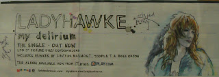
Advert/Poster Research
During planning the album cover, i researched and gathered different promotional posters to pull and gather ideas for our poster. I trawled through NME magazines to get all the images and specifically chose posters from bands which fitted the same genres and target market. I cut all the posters out and then put together a collage of them all and annotated the individual posters within, analysing the positioning of images, the rule of thirds, house styles and colour schemes.
When i analysed the individual covers, i found that especially with the album advertisements, the house style was identical to the album covers, so therefore we must have the same house styles and colours, this is evident on the Kaiser Chiefs and Vampire Weekend adverts, this is partly because the album cover is the advert bar a few extra additions. This is potentially something we may do, use the same image as the cover, or a variation. The colours we use need to be in relation to the colours evident in the video and album cover, this will tie all the project together. House style will be evident throughout and it crucially important.
In addition, i also found that all the images were specifically taken in relation to the rule of thirds and were specifically placed in the editing process, or the taking of the picture, for example The Kills' advert. The image that we take needs to be in relation to the rule of thirds and the props or humans need to be in appropriate positions. In addition the overlays on photoshop will be placed in relation to the rule of thirds, utilising dead zones with logos and placing titles and review boxes in the best possible places. I will definitely utilise this in our advert poster.
The text fonts and style we use need to bold are punchy, they need to stand out and jump out the audience, perhaps in black, white or red. They need to identify what the poster is about and with the reviews, they need to sell the product. In order for our poster to attract the audience i will definitely use bold texts and emphatic font colours/fonts to utilise this effect.
Here are the examples of advertisements that i gathered and analysed.


Tuesday, 30 March 2010
Album Cover Plans
Following on from researching covers, we then planned out covers, drawing them out, marking them up with rules of thirds, and annotating what will be where on the covers, in doing this it will help us to not go off on a tangent when taking photos, these plans provide us with a basic outline of a few ideas to work from/to.
We will use the walls in the practice room to be the background for the album cover because it adds a sense of continuity from the video into the album cover, almost like a house style. It ties it all together. We have initially planned to have us sat on the floor as the plan states, but we're leaving room for improvisation regarding our positions and photoshop effects. We will be placed in relation to the rule of thirds regardless.
We plan to have the title of the album at the top in the middle, and will use the same font for it that we will use elsewhere in the project. Placing the title and band name in this area will make it stand out, which is vitally important with the cover.
We have a couple of plans for the back cover too, the initial ideas are that it will be the wall that the front cover is being taken on, with the song titles stuck to the walls in even spaces from top to bottom, then all the small print overlaid on photoshop elements. The second idea is that we have a setlist wrote out with all the tracks on it, like a gig situation, and a picture of this on a black background, once again with the small print overlaid on photoshop. We feel like this idea fits with the ethos of the genre too, the scruffy teenage bedroom vibe.
The spine of the digi-pack will the same background as the back cover, but with the band and album title overlaid in the same font as the front cover. It will also have the record label's logo on the bottom and Biffy Clyro's logo on the top.
Here are the sketches i drew out for the plan...


Album Cover Research
After we'd started filming the video, i started to conduct research into album covers for the digi-pack, i started to gather images of different band's covers that remained within the same genres/sub genres that Biffy Clyro sit within and got some Biffy Clyro covers too. I gathered all of the images and put them into a collage to display the range of styles we can take ideas from.
I then went on to pick individual covers and analyse them, and make annotations on the covers. All of the album covers fitted within the rule of thirds, which helps sections of the cover stand out and shine through. So when we would set up the shots for the cover, we knew that we were going to stick to rule of thirds and stand where the lines would be. Then when we layer up the titles and other logos, they would stand out on the cover and not be in random unnecessary places.
From analysing the covers, i gathered ideas on house styles and how the cover needs to have some common theme to it, that exists between adverts, front and back cover. This is evident on pretty much any album cover ever created so we need to have a house style. We will be sure to establish this over all the segments of the project including the titles in the video too.
Here are the images of the physical planning i did for this section.


Subscribe to:
Posts (Atom)