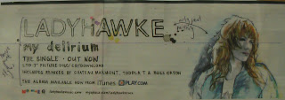
When i analysed the individual covers, i found that especially with the album advertisements, the house style was identical to the album covers, so therefore we must have the same house styles and colours, this is evident on the Kaiser Chiefs and Vampire Weekend adverts, this is partly because the album cover is the advert bar a few extra additions. This is potentially something we may do, use the same image as the cover, or a variation. The colours we use need to be in relation to the colours evident in the video and album cover, this will tie all the project together. House style will be evident throughout and it crucially important.
In addition, i also found that all the images were specifically taken in relation to the rule of thirds and were specifically placed in the editing process, or the taking of the picture, for example The Kills' advert. The image that we take needs to be in relation to the rule of thirds and the props or humans need to be in appropriate positions. In addition the overlays on photoshop will be placed in relation to the rule of thirds, utilising dead zones with logos and placing titles and review boxes in the best possible places. I will definitely utilise this in our advert poster.
The text fonts and style we use need to bold are punchy, they need to stand out and jump out the audience, perhaps in black, white or red. They need to identify what the poster is about and with the reviews, they need to sell the product. In order for our poster to attract the audience i will definitely use bold texts and emphatic font colours/fonts to utilise this effect.
Here are the examples of advertisements that i gathered and analysed.


No comments:
Post a Comment