As we planned for the front cover, in order to keep a consistent feel throughout the project we will use the background in the practice room. It again re-inforces the house style. We have various ideas for the advert in terms of what will be on the page, we might well use the plan of the guitar and amp, or have the album cover shot, or a variation to fill the advert, it could also be horizontal or vertical as the plans show.
We will use the same fonts we have used on the album cover and the titles of the video, these will be in bold like the adverts i researched, and most probably centralised on the page, in order to stand out and be the first thing the audience see. We will use italics for the reviews box, this is used frequently in a lot of adverts and differentiates the text within the same house style. We will also have the record label's logo and the band's logo in the dead areas, this will draw eyes to it and not just leave it with nothing there. I feel like filling this gap on the page almost adds a wall to the final design and boxes it all together.
We are leaving improvisation open for the actual image too, it will be of the band, but effects and other photoshop filters are open to be played around with.
As with most of the project we are leaving room for improvisation, we feel creativity is stimulated this way and fits with the conventions of the genre and Biffy Clyro.
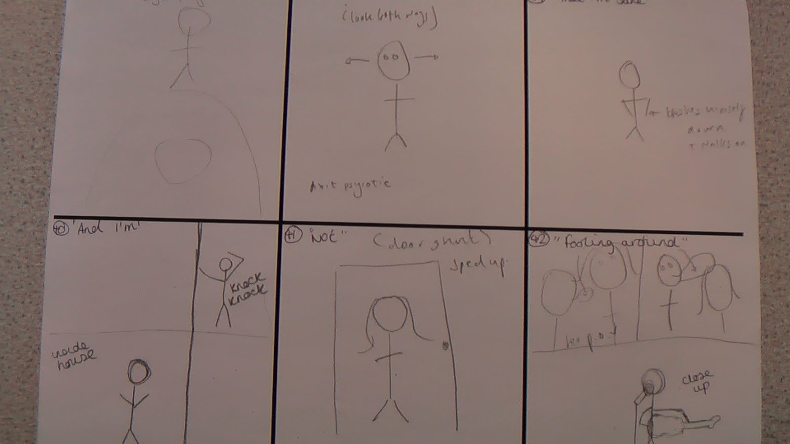
Here are the sketches i did for the advert/poster.